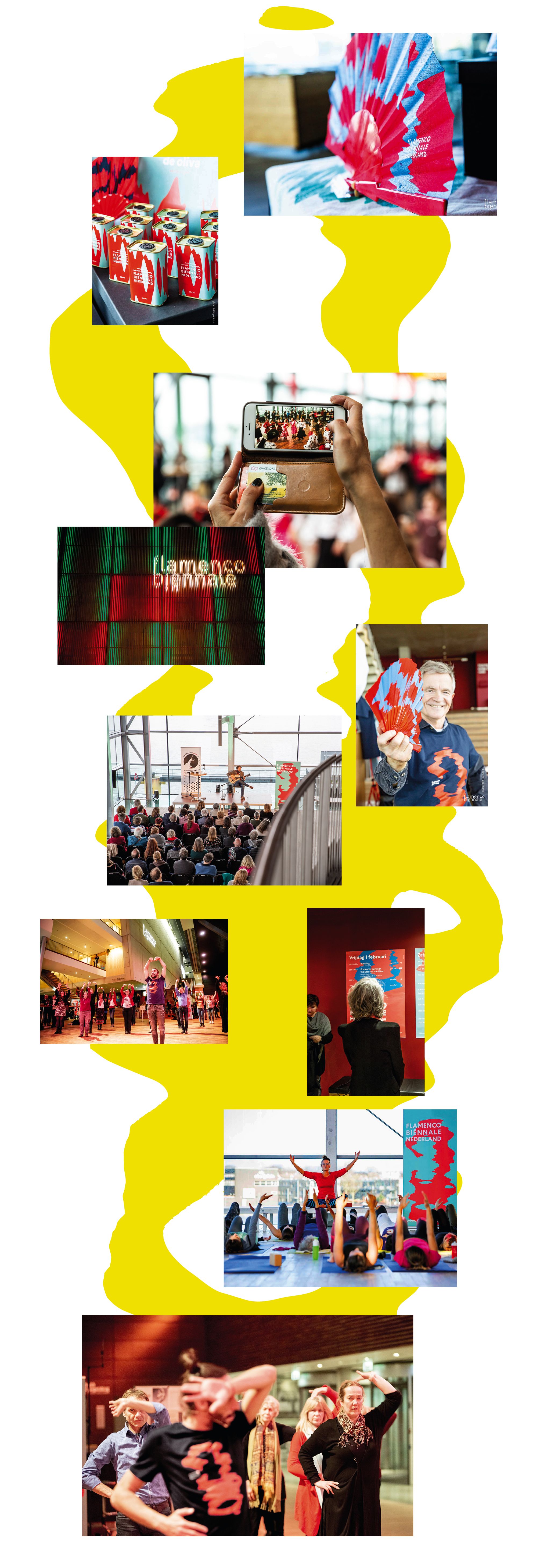
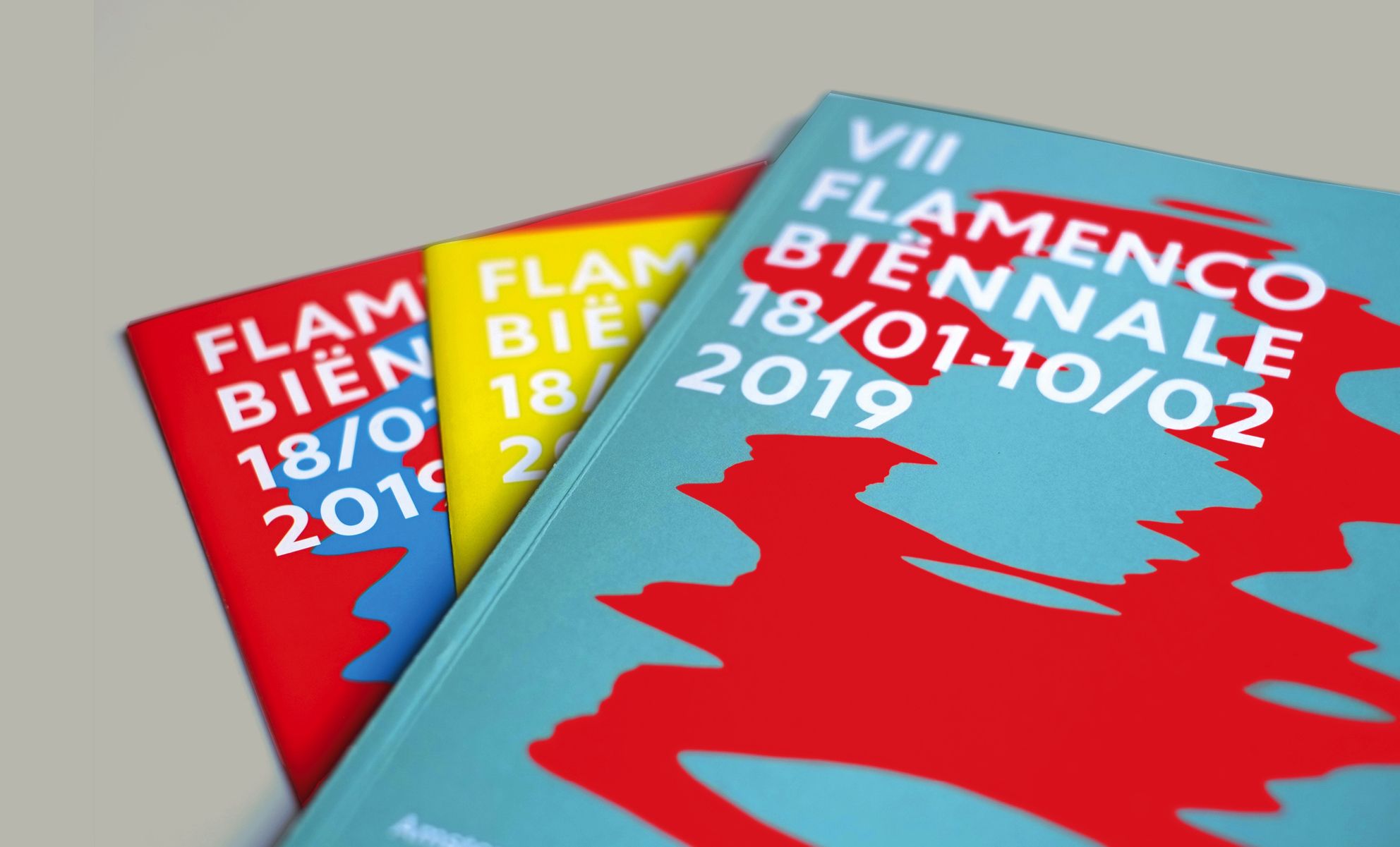
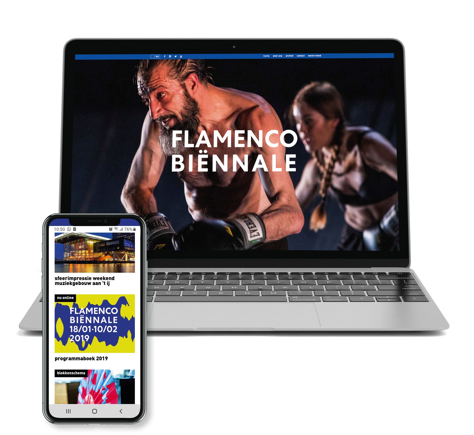
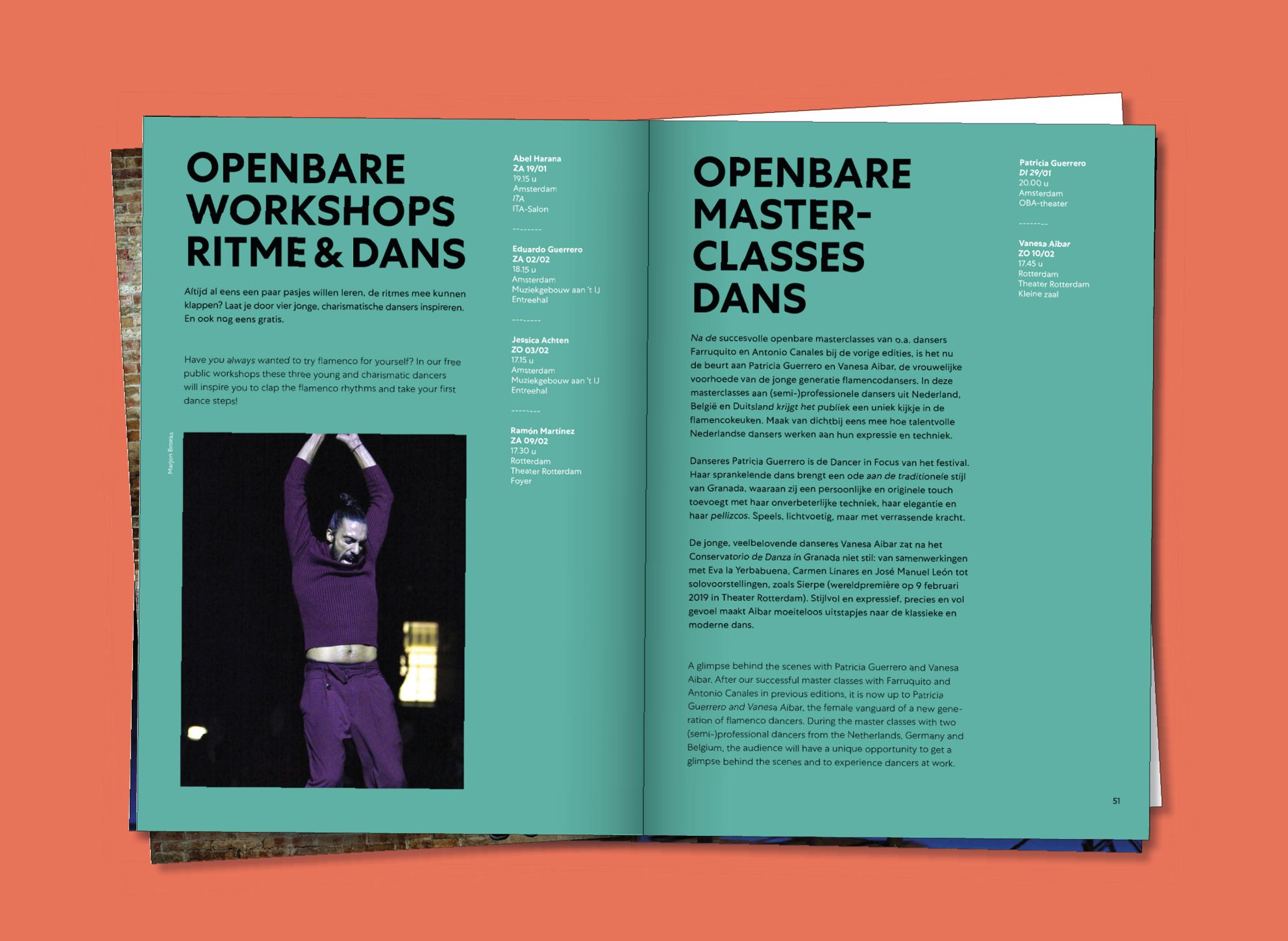
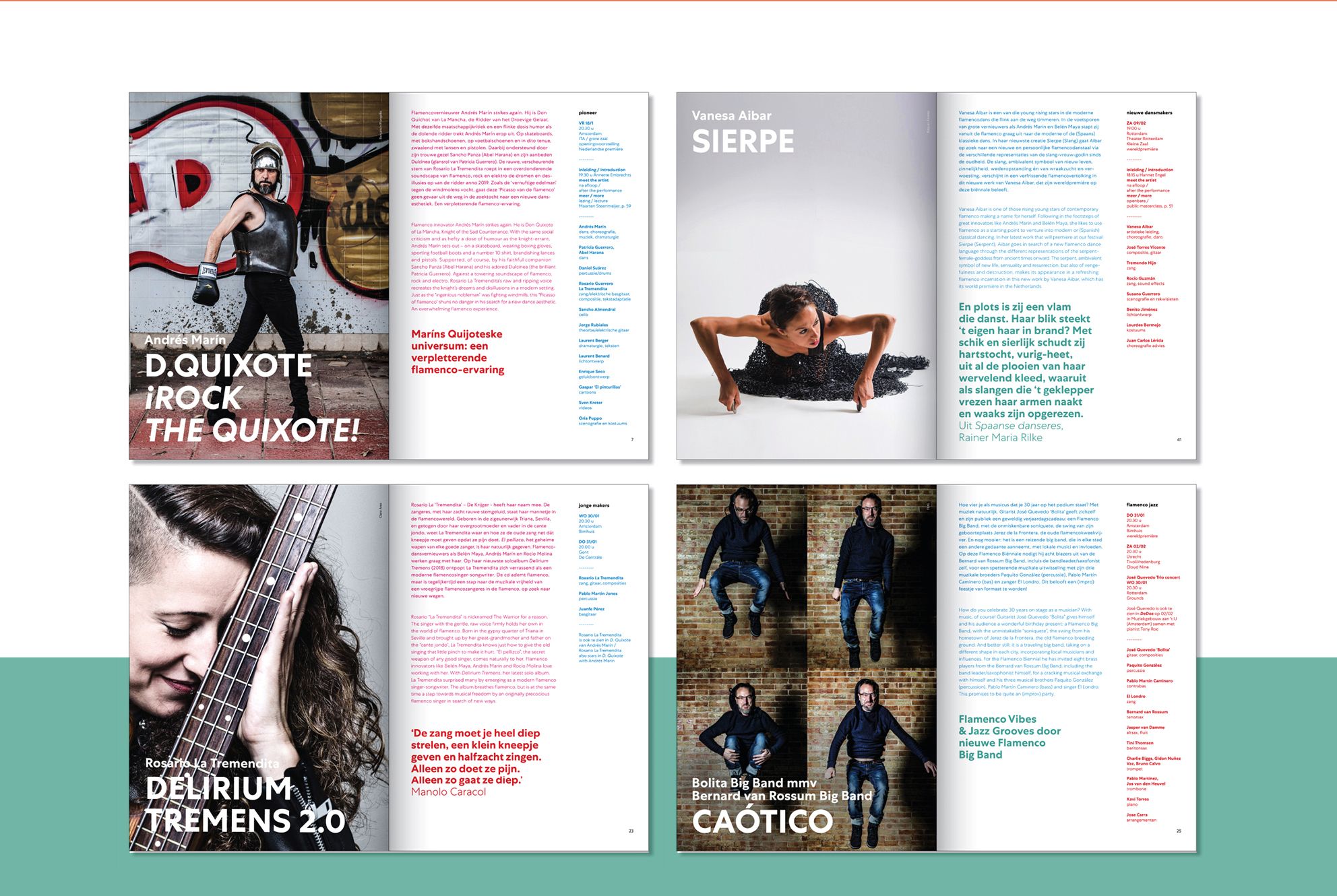
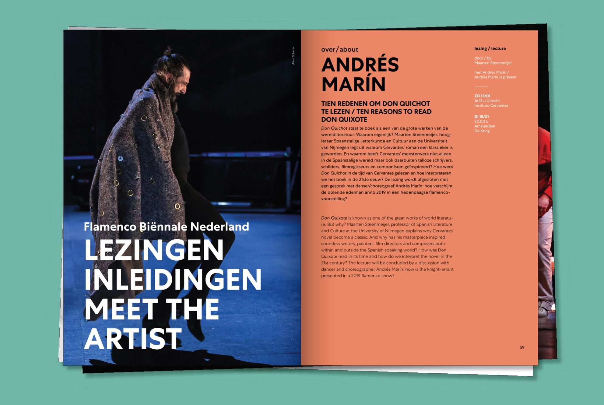
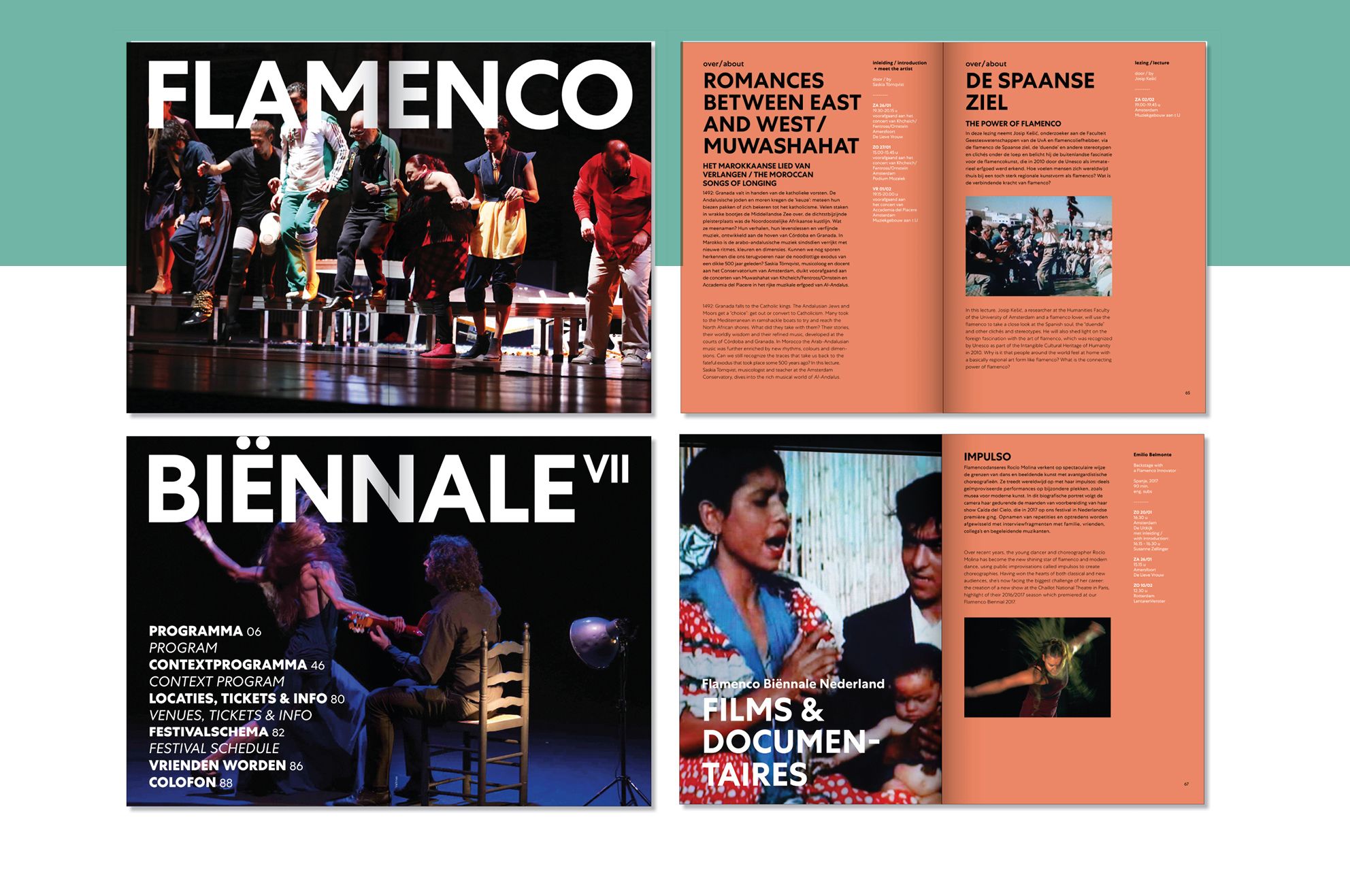
The approach also needed to facilitate viewing and identifying the various events taking place during the festival. Their ambition was to reach out to a larger audience, instead of only the die-hard flamenco lovers. Since this fest was not associated with a conventional view of flamenco, but more about innovation and a new experimental view of the art form, our graphics were created to support this vision. Our design approach brought in a sense of enthusiasm in the dark winter months which is when the event takes place. We elevated the average person above the artists for a more inclusive interaction with the public. The graphics used were inspired by expansion waves produced in Flamenco music, which also represented movement. A colourful friendly palette and strong distinct typography helped in making the event more approachable. To encourage the essence of sharing and doing things together we created wearable merchandise. A distinct visual brand language was extended to the merchandise, improving and personalizing social media communication. This helped the brand gain recognition.
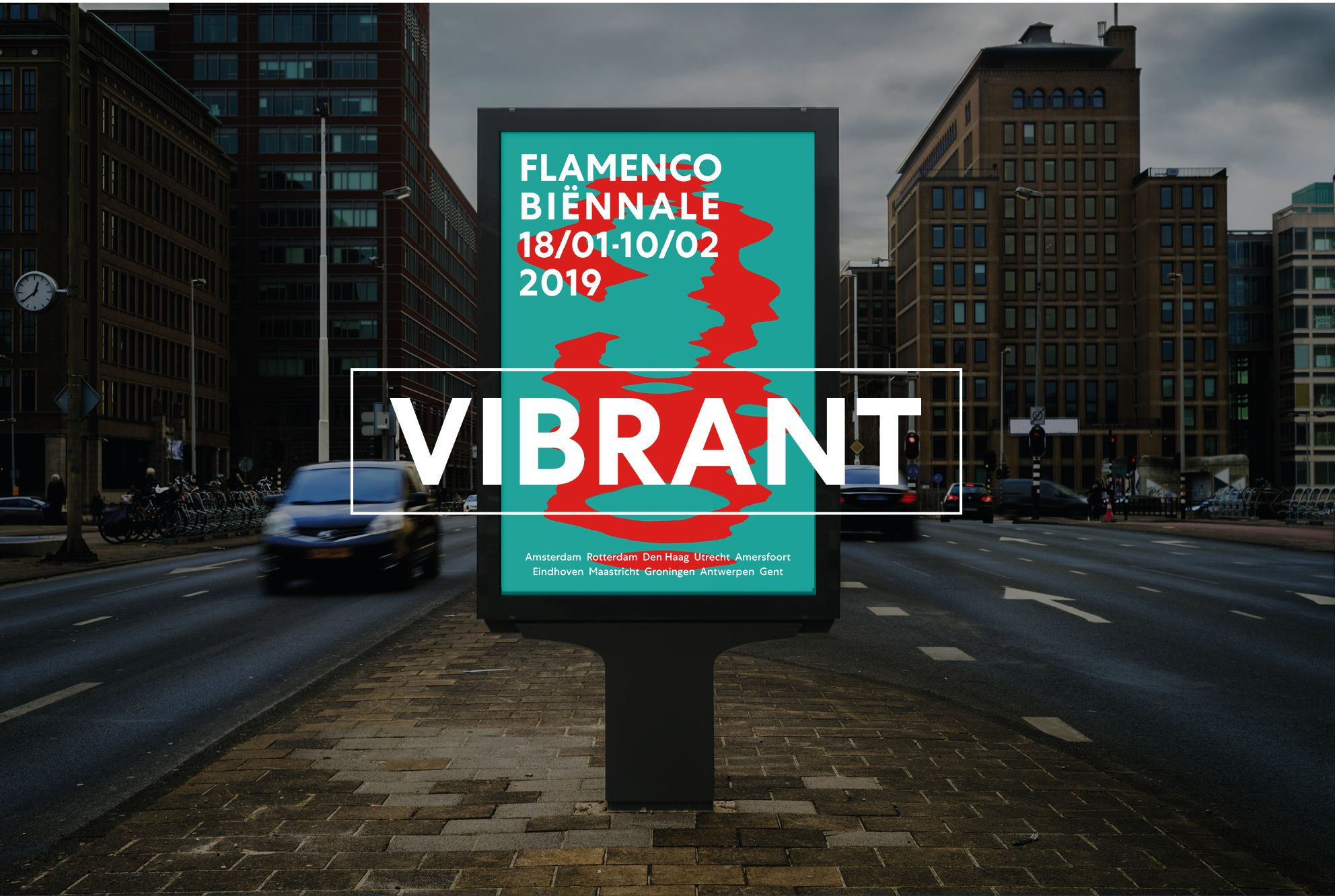
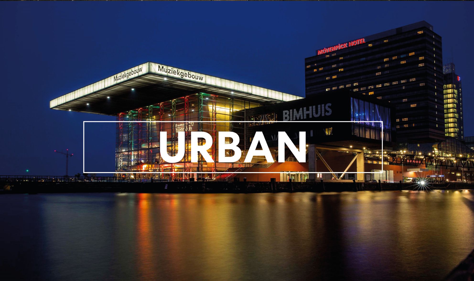
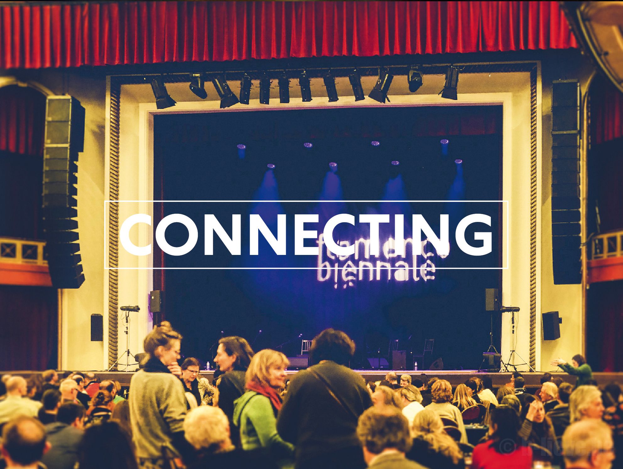
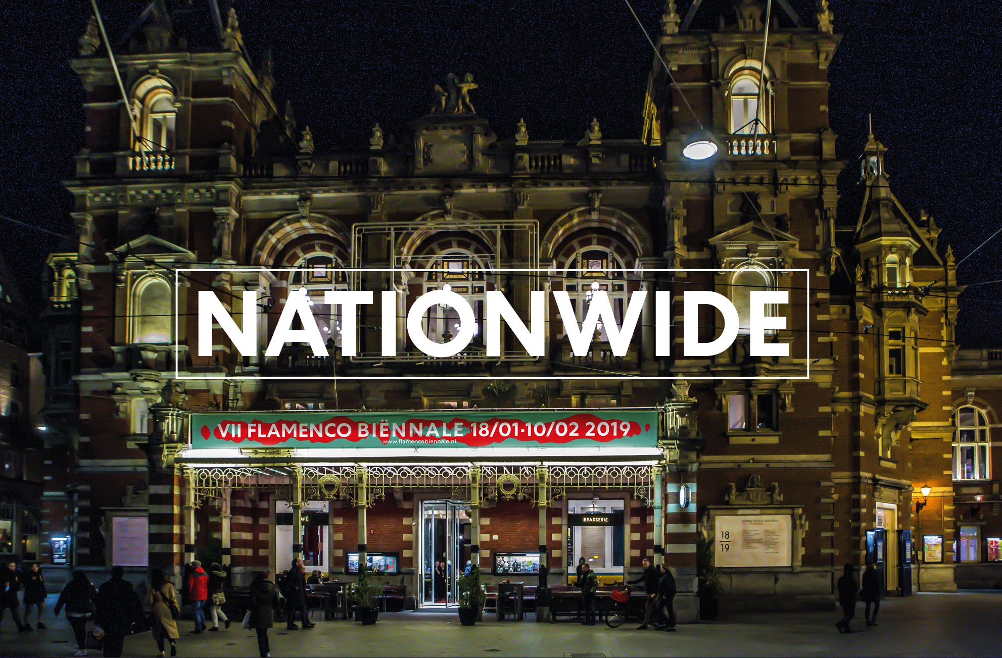
Colourful communication graphics were placed around the city and each of the locations had a festive feeling with people participating with great energy. Clear typography with a defined hierarchy, and structured use of photography and layouts, was applied to all communication items. This helped establish Flamenco Biënnale Netherlands, as an up-to-date and energetic meeting point for contemporary music rooted in the past, but with a vision of the future. Flamenco Biënnale was also nominated for the 2019 Amsterdamse Prijs Voor De Kunst (city of Amsterdam prize for arts) as a result of this powerful re-branding.
client: Flamenco Biënnale Netherland / head marcom: Marie-Christine Vink / brand identity, graphics, on- & offline applications: Lopezlab Amsterdam, Mariola Lopez Mariño, Anjana Nair / film: Felix Vazquez / animation: Astrid Martirossian