
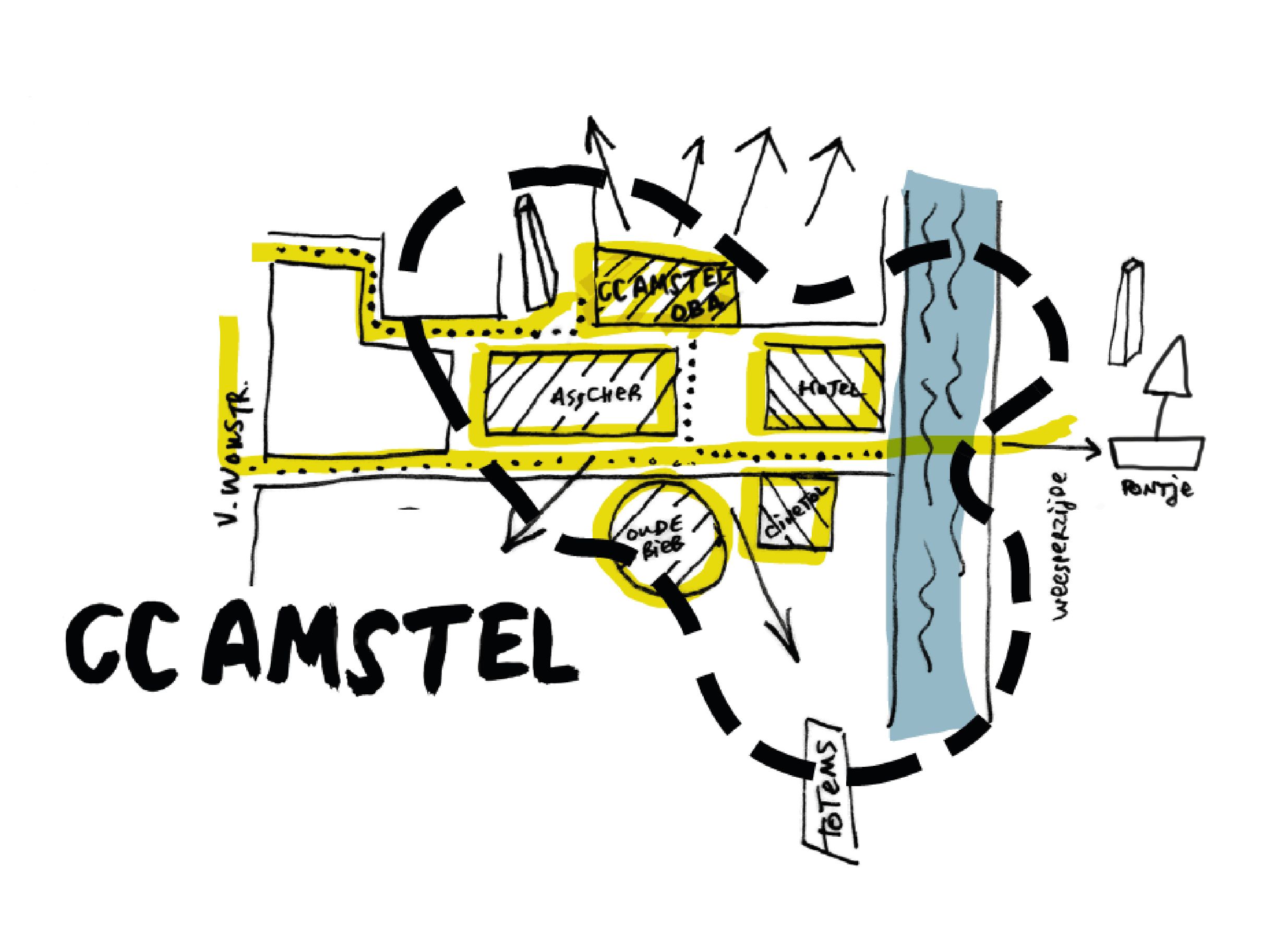
Together with the marketing and the direction team of the theatre, we were commissioned to give a face to this new initiative and also stimulate active citizenship.
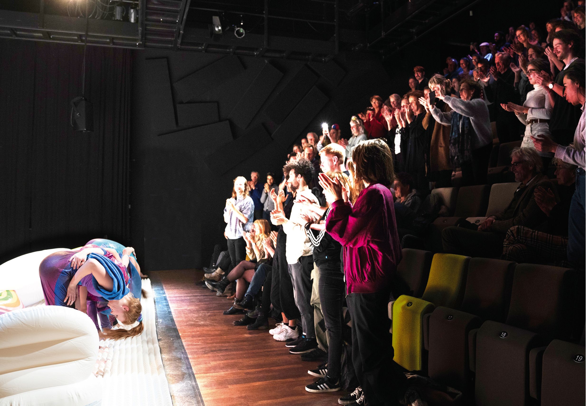
Our approach incorporated the core values of the theatre, which were - Quality, Personal Connection with the Other, Alertness - with a fast response to new trends in society, Rebelliousness - not assuming the relevance of the existing order and always questioning and looking for different ways to connect and inspire visitors and friends. Working with these values, we viewed the theatre and its surroundings as a country and at a smaller scale of a village, where communities come together to celebrate life, learn from each other, create bonds, and shared cultural, social and community activities.
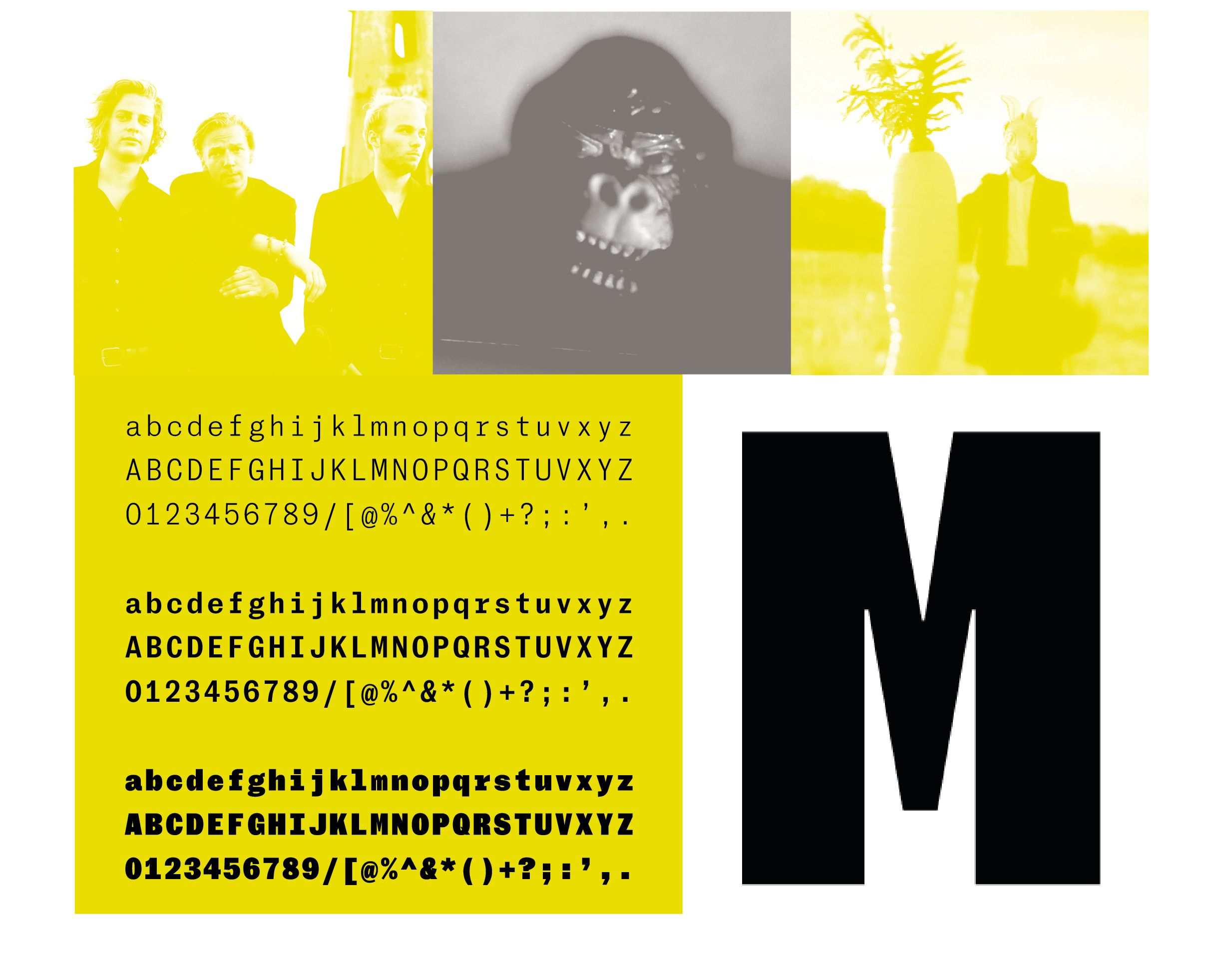
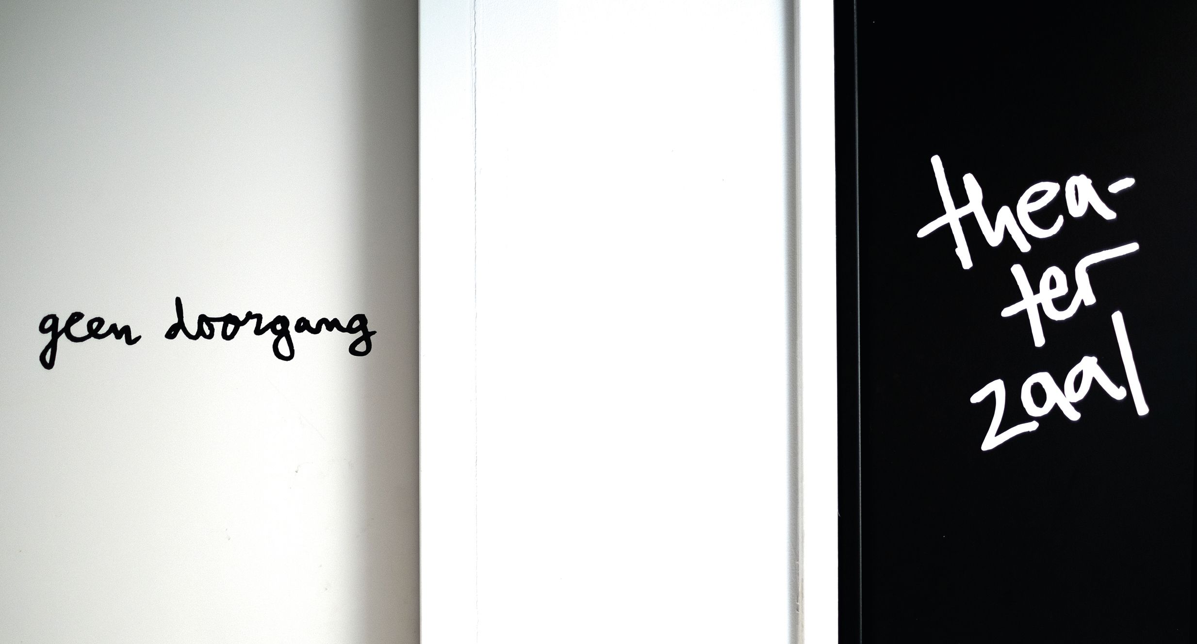
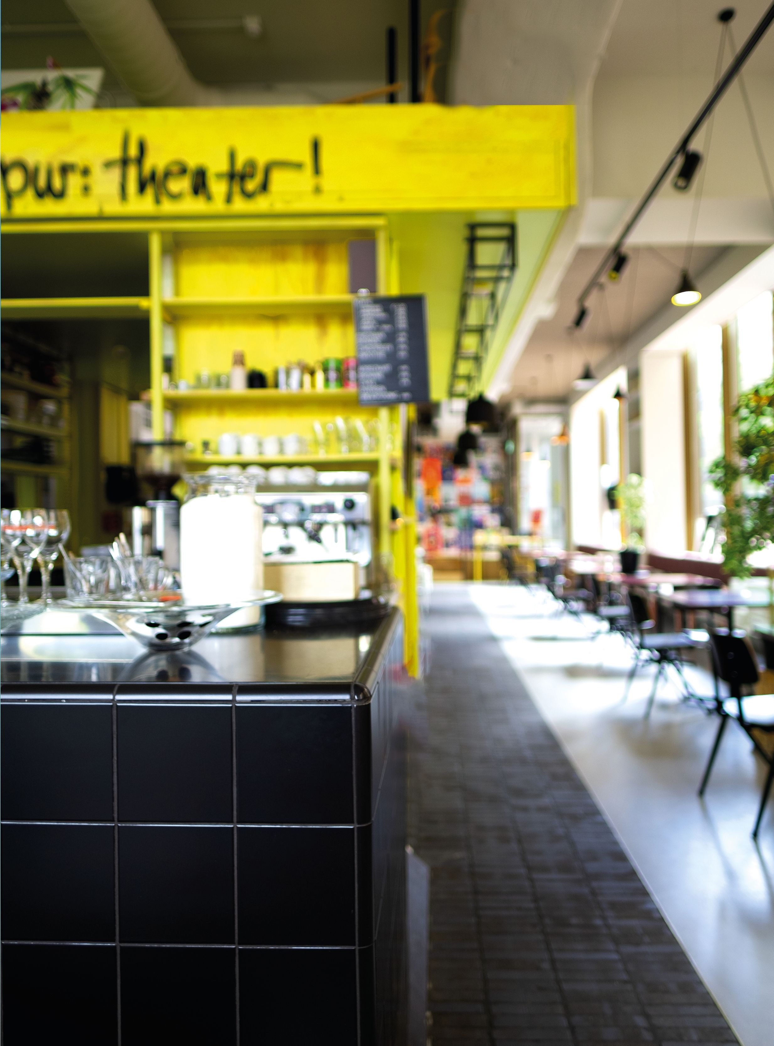
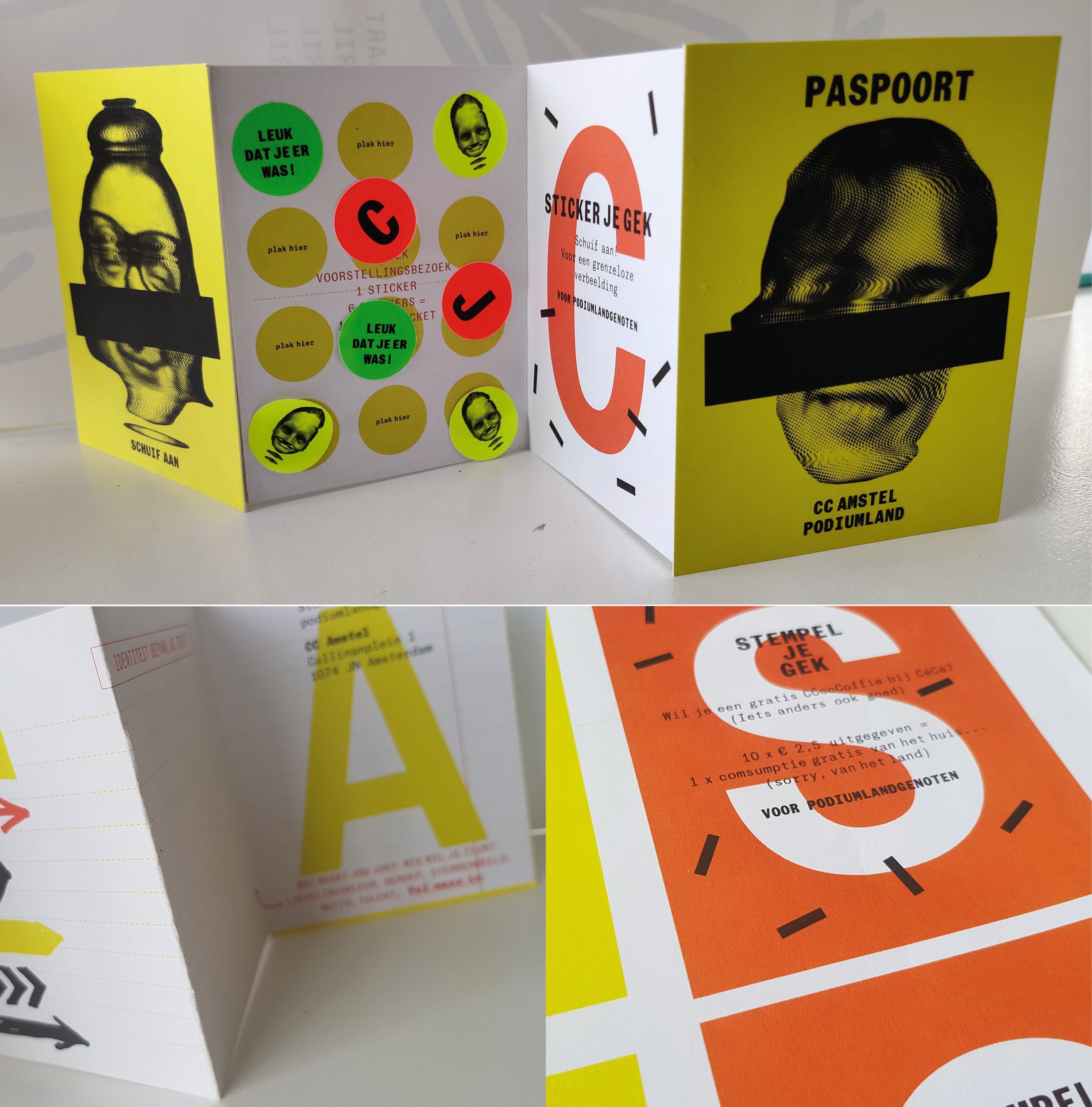
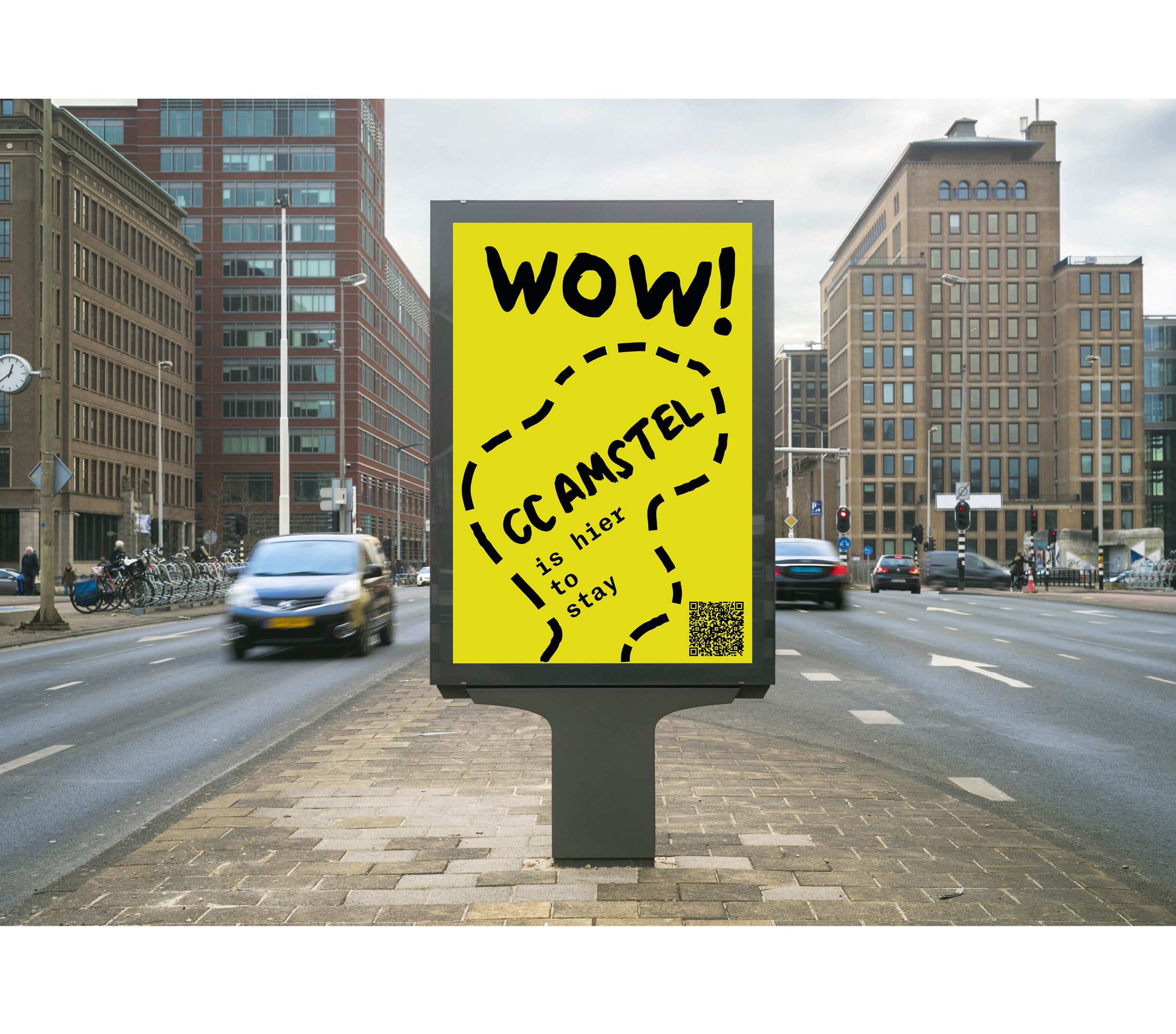
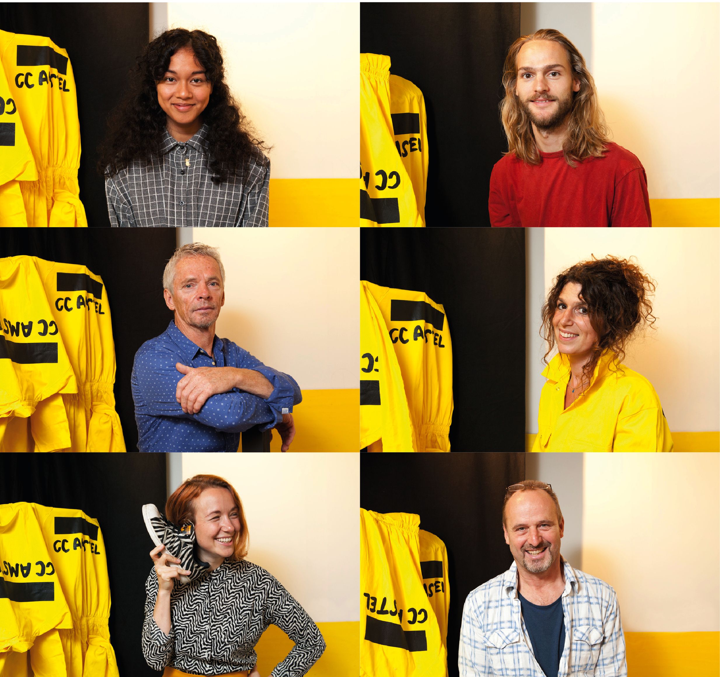
A bold colour palette of yellow with black was used as a graphic means to optimise communication and limit the effort put into it. Using this colour palette and continuing the lively, bold approach we generated multiple handwritten logos gathered with the help of the visitors, friends and neighbours of the theatre. The handwritten name of the theatre, perfectly evoked the identity of an ever-changing space, constantly evolving with the people visiting it.
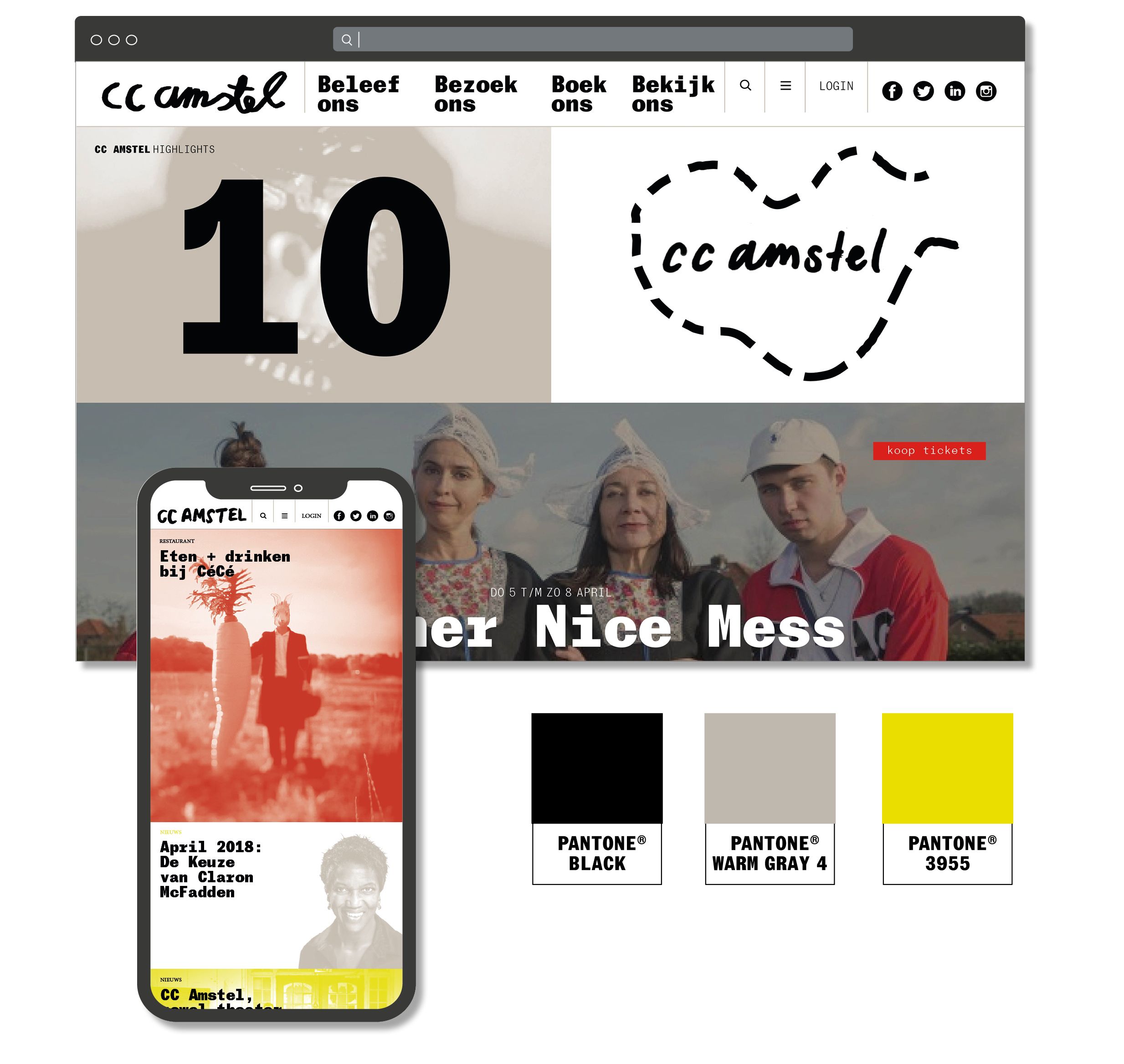

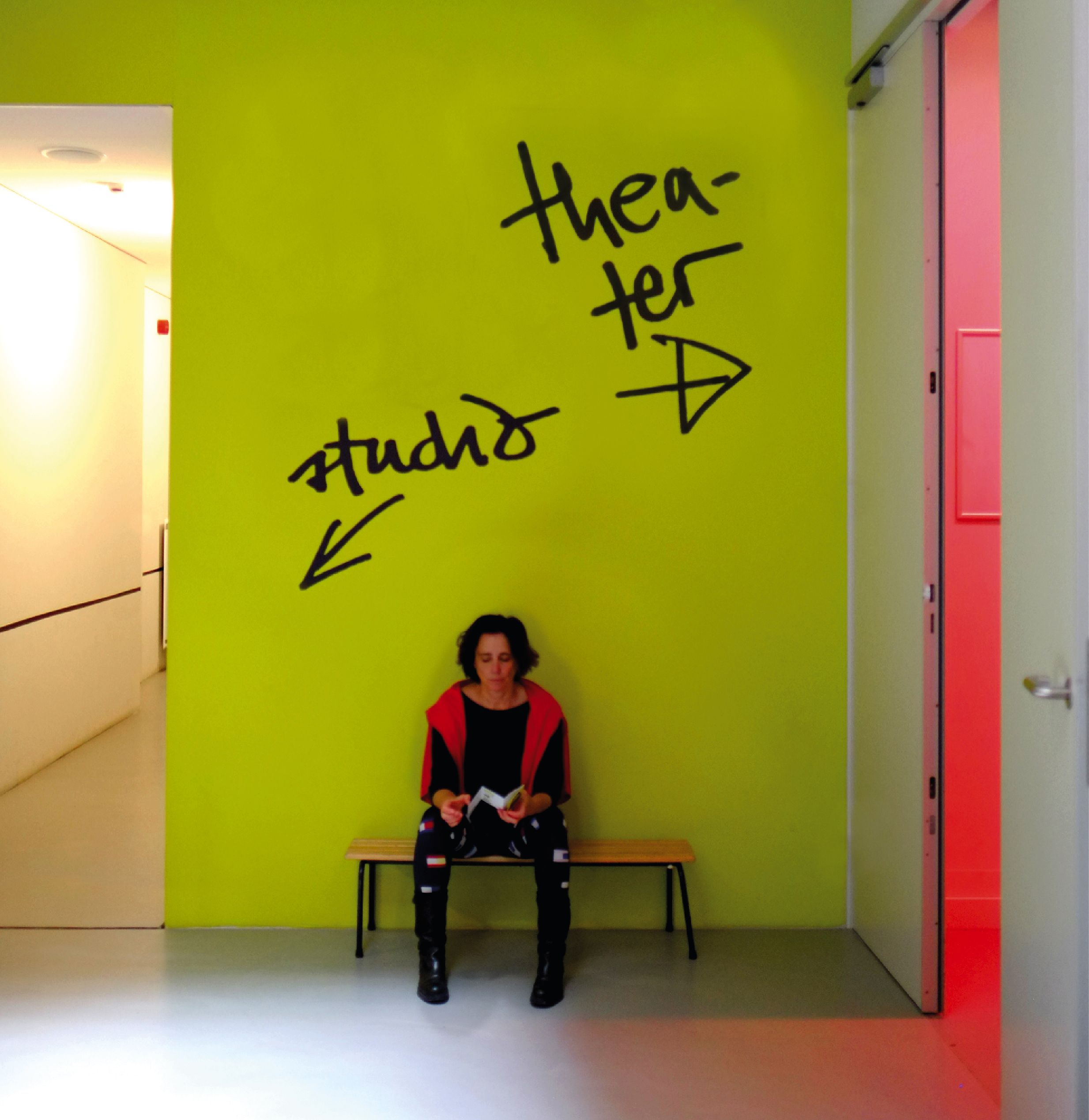
The usage extended to online communication applications, social media platforms, promotional films, interiors, 3D applications and various other communication channels. The result was a distinct corporate identity, easy to apply and recognize. This approach successfully achieved for the new theatre their goals of increasing recognition, visibility and consistency, establishing them as a part of the cultural and social life of the cosmopolitan city of Amsterdam.
client: CC Amstel Theater, Amsterdam / brand concept development & design: Lopezlab Amsterdam, Mariola Lopez Mariño / website development: NotFound Digital Creativity / photography: Miriam van Beurden, Claudia Lasarte / interior consultancy: Mariola Lopez Mariño, Annekatrien van Meegen / interior development: Mars Interieurarchitecten